Monday 27 May 2013

Logo Analysis
Apple


First Logo, 1976-1976
The first apple logo features Isaac Newton under an apple tree; it wasn't used for very long because of the way it didn't look like the kind of logo you’d expect from a computing company. It is using the Isaac Newton scene because it features the apple and a person that at the time ‘thought different.’ ‘Think different’ is the Apple company slogan.


Second logo, 1976-1998
This is the first one with the still used half eaten outline. This one features a rainbow colour scheme. The bite could have represented a play on words as byte/bite because a byte is a unit of digital information. The colours are in no particular order apart from the green at the top because green is the colour of the leaf.


Third Logo, 1998-present
This logo maintains the Apple outline used in the second one but has a colour change and is given a third dimension.  The logo is colourized grey and is made to look almost clear and glassy, but it still can look metallic. The logo also is looks like it’s popping out of the media.


Microsoft Windows.


First Logo, 1985-1991
The first logo Microsoft used for Windows was extremely different to the rest of the Windows logos, it still represents actual windows like the ones used in a house but they are different sizes and they are the same colour of a light blue, like glass is sometimes represented as a light blue. The beams between the panes of glass are white and blend with the background.


Second logos, 1992-2000
The second logo is quite different from the first one, it has multi-coloured window panes and darker outlines for the beams between the window panes.  It also has a wavy effect.  And a particle trail.


Third Logo, 2001-2011
The third logo used by Microsoft Windows is similar to the second one in the way that it has the four different colours in each pane. It has the beams removed from the “windows” and just looks like four different floating squares. They are quite curved in varying ways for each pane.  There are two more variations on this logo, the second variation has a navy blue circle around it and the third variation is almost the same as the first apart from it seems to have a spotlight centred in the middle.


Fourth Logo, 2012 – Present


The fourth Microsoft Windows logo is very similar to the first logo, it has the same colour scheme as all the window panes are a light blue colour to make the panes look more “glass like.” The logo is also quite unbalanced because the logo as a hole appear s to go back to a focal point making the logo smaller on one side.


KFC


First Logo and Second Logo 1952-1991
The first KFC logo is spelt out in full as “Kentucky Fried Chicken” with the famous Colonel Sanders face logo. It uses a very 1950’s looking font which is why the second logo is pretty much just an updated font and the face has been relocated.


Third Logo 1991-1996
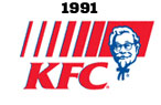
The third logo used by KFC has the Kentucky Fried Chicken abbreviated to KFC and is now using the red and blue colours KFC typically uses. It still keeps the Colonel Sanders face in the same position as the other two but now uses blue instead of black as the outline.


Fourth Logo - Present


The Colonel Sanders face has been altered slightly, to make him face a different direction and is reverted back to black outlines for the face, he also now is wearing an apron.  The colour blue has been removed completely and there are no words left either because of how famous the face has become.   


Starbucks

First Logo
The first logo of Starbucks has a mermaid in the middle of a brown circle with the words “Starbucks – Coffee – Tea – Spices. They sold these before they became a coffee enterprise. They probably used brown because that is typical the colour of coffee and tea.


Second logo
The original words of “Starbucks – Coffee – Tea – Spices” have just been replaced with Starbucks – Coffee. The outside circle is green and the inside picture is white on a brown background. The mermaid has also been changed from a detailed picture to a more simplified mermaid.


Third Logo
The third logo is almost completely the same as the second logo but the mermaid has been zoomed in on so the majority has been cut.


Fourth logo
They have completely removed any writing from the logo and the outside logo. The logo is still circular. The mermaid background has also been changed to green and been increased in size. The reason they probably removed the words is because the logo is well recognized anyway.

Wednesday 8 May 2013

Task 2 Analysing design conventions


Corporate Branding
The colours used in this style are very vibrant colours that want to stick out at you. Because this style can have forms of advertising, the images want to stick out at you and grab your attention so bright and bold is the way to go. The main images in this style are normally images that will try to grab your attention. These may include typography because people are likely to automatically look at words to read them.  The main image will take up most of image because there normally isn't much else put on the posters. The influence on this style is new and emerging technologies such as computers and programs. The layout in this style has a lot of text and typography implicated all over it because the image is trying to convey a product or consumable. This style is heavily composed of coloured fonts and text. It sometimes has images but is mostly text. This style is mostly text and typography so it can vary a lot in this style, it can even be unreadable. The technique used in this style uses a lot of computers and computer programs to edit and make fonts and images.


Handmade

The colours used in this style are quite often organic and earthy colours, for example, browns and earthy tones. Although there are other colours used, these are probably used most because the artists use wood and organics in their works. The main images used in this style would also be things you find in the wild, like flowers and animals. There is also an abundance of wood but it isn't used as a main picture, more of a framing tool. The positive space in this style is very spread over a background, but if you change the position of your point of view changes, giving the works very good depth. The negative space is very diluted since the positive space is so spread out. This style of art is influenced by nature and the wild. There is an abundance of things like birds and wood in the art works so this is probably the main influence. The layout of the images is usually in boxes and on shelves making it a very dimensional style. The style can be very short (in terms of height) because it could just be one row of shelves. Or very tall using multiple rows. This style uses little type. When their is some sort of writing, it's not always meant to be distinguishable. The main techniques used in the style are placement of objects, crafting, sculpting and framing.


Pre-digital design

The colours in pre-digital design aren't as vivid and vibrant as computer enhanced stuff, a lot of browns are used, therefore make the image look kind of bleak if the colour range is used incorrectly. 
The main images used are people animals, and figures. There isn't a lot of detail mixed into the images and are quite plain and simplistic. The backgrounds are rather colourless or monotonial, meaning the negative space is quite flat, or dimensionless. The composition of this style is quite often a figure or animal on a monotone or simple background. The text/type is an obviously 1920s-30s era font that is easy to read. The colour of the text high contrast to the background but still looks good with the image. The techniques used by the artists in this style are paints and pencils, because there are no computers or programs.


Digital effects
The colours used with digital effects are colours that can be used with a computer to enhance or generate imagery. Colours that could be used are shade colours to make the main image more prominent by darkening the background and enhancing the main image by brightening it or vice versa, creating a heavy contrast between the two. Otherwise the colours can be rather bright and intimidating. The main imagery created with digital effects can look false/fake and wrong if the artist is inexperienced making digital effects a hard medium to use. Because digital effects are a common way to enhance an image, or make an image to use for a movie, the spacing is a lot like that of photographs, being real-world settings and spacing. Seeing as digital effects are on a computer, they are easy to upload to the internet and share around, meaning a lot of people see them and the influence spreads. Forums on the internet like deviant art are places where people share and discuss art, causing them to influence and motivate each other. The images are normally laid out with typical formatting i.e. a main image/foreground and background. The images are varied therefore the composition of the images can vary a lot too, although it is quite common in action movie posters to use an exciting scene from the movie created by digital means, the image will be a main component from the movie centred and enhanced to make the movie seem more exciting. Because it is done on a computer, text/type in a digital image is quite easy to add and change the fonts on. The techniques used in digital effects are specialist programs and tools on a computer such as  the tools on photoshop and the programs itself, another program used could be aftereffects.


Illustration
Illustration uses colours and greys for rendering to make the images seem more realistic. In non-realistic illustration, colours are very dense and vivid to make the image grab your attention more. The colours could work well by contrasting them with a dominant colour over the background colour to make the image more prominent. The spacing in illustration normally take a lot of space to make the picture stick out more and give you a better picture, rather than it being really small and making the background dominant.  Illustration is normally used in duality with a story or similar texts, therefore mostly influenced by the story and the descriptions provided by the author. Illustration layouts are extremely varied because of how vague the term illustration is. They can be landscape images depicting scenes from books described by the author, characters, objects or even visual illusions. The composition is varied as well, because of how varied illustration can be. The style doesn't normally use type/text that much unless it was used in signage from the story/text, it can also be used for caption and such, but captions are not only limited to illustration. There are a lot of different techniques used for illustration, drawing and cartooning different mediums is a main component though.

Typography
The colours used in typography are normally used to make the letters contrast with the negative space/background to make the text more legible. The main images in this style are mostly made from text and type or are covered in it. The text can sometimes be hard to read but is used to make a point. The spacing with typography varies hugely because of the different fonts and spacing that can be used. There could be a very condensed word or sentence to make the focus on that, or you could spread it out so you cover the entire work so it’s the only thing you see. The style was properly influenced by artists such as David Carson and Neville Brody. It is used to express text/type for more than just the common writing words are normally used for text based images and artworks. The layouts in this style orientate around text/type. Typography dominates most of the image and actual images and pictures are sometimes a minor part. Typography is normally composed of text although it is not always readable. Typography can use some imagery. Considering typography is text/type, the text/type is used 100% in typography even though it is sometimes unreadable. The techniques used are writing and fonts, computers are also a big part of typography and are good with quickly figuring out different fonts.


Graffiti

Graffiti has a wide range of very vivid colour, but uses blacks for outlines to give form to the pictures and words. The main images of graffiti are usually the large bulging letters used or the cartoonish pictures. The spacing with graffiti is normally an extremely centred image on a wall, meaning that the image is very dominant and protruding. A lot of the influences on graffiti are self-expression and wanting to get a personal message across. Although it is considered vandalism, graffiti by artists (e.g. Banksy) is more trying to convey a message. Graffiti layout is done so that the main image is done on a plain background being much centred. The type/text in graffiti is usually very clear, as someone is trying to convey a message, or outright impossible in some of the “vandal graffiti.” Techniques used in graffiti spray-painting techniques and stencils. 
Hard to read "vandal graffiti"


Singular image on wall with large
negative space.

3.1 DES300 Research and Analysis

DES300-3.1
Task 1- Analysing 4 designers
Task 2 -Analysing 7 Design Approaches/Conventions
Task 3 -Comparing any 2 Conventions
Task 4 -Indepth analysis of one designer

Tuesday 26 March 2013

Task 4 - Interpretation


Steve Yee's Typographic Portrait Of Thom Yorke
Done in Early 2009


I am doing my Task 4 on the design by the designer Steve Yee. The image is designed in a digital form. The subject matter is a piece advertising the 51st annual Grammy's. They used Yorke's face because he and his band, Radiohead were to be playing at the Grammy's and were nominated for prizes. The piece is composed of the main image, the face with the white negative space as a background. The typography formed into the face of Thom Yorke.  There is light in the top left of the piece, probably expressing stage lights, because the Grammy's are about music. The method used would probably be writing the word in the fonts and colours and arranging it into the form of the face, then adding the textures to the negative space and using after effects on the main image. 
Hail to the Thief, the cover art for a
Radiohead album
I like this image because it's basic but complex at the same time. It's also similar to the cover for Hail to the Thief by Thom's Band, Radiohead. They are similar in terms of colour and being a mainly typographacal piece of art. The ting that made me dislike the piece is because of some of the colours used.
Coldplay, another one of the bands used.


This image of Coldplay, would have been done using the same techniques, although, this one doesn't have the light in it. It would have taken a lot more words because there are more people. The one of Thom Yorke, (first one) wouldn't have used the whole band because there are a lot more members than Coldplay It uses different colours, replacing the red with a purple colour. When zooming in on the works, it looks as thought the smaller words, aren't actually words, rather lines that have been formed into words. This one is done in landscape rather than portrait unlike the first one. 


Bibliography:

http://www.steveyee.net/The-Grammys
http://tbwachiatday.com/
http://en.wikipedia.org/wiki/2009_Grammy_Awards
https://www.google.co.nz/imghp?hl=en&tab=ii
http://en.wikipedia.org/wiki/Radiohead
http://www.typetheory.com/?p=741
http://hannahfurnell.wordpress.com/tag/tbwachiatday/
http://www.typetheory.com/?p=741
http://www.typedimage.com/portraits.html
http://thefunkyrooster.wordpress.com/2009/02/03/grammys-typographic-posters/
http://tutorials.downloadroute.com/external-149369.html

Task 3 - Comparison.

Task 3 - Comparison. 

I am going to compare Pre-digital design and Illustration.


Colour: The styles are very similar in terms of colour because of the era. Neither use computers so they are done with paints or colouring pencils. There aren't a lot of differences because of the techniques used. 


Main Image: The main images are quite similar. They both have people as a main image. They vary where illustration uses landscapes and pre-digital uses typography to convey ideas.


Space: The two different styles have a main image (people, figures and animals) surrounded by a background. Illustration will sometimes use a plain white background for negative space and pre-digital design will use very plain background. 


Influences: They are different in terms of the influences. Illustrations are quite often used in storybooks and are influenced by the author and how he crafts his words. Pre-digital design is quite often an advertisement for something so how it turns out is depending on what the product is. 


Layout: The styles are quite similar in terms of layout. The pictures in pre-digital are quite often portrait and will centre the main image. Illustration can be any orientation but will also centre the main image.


Composition: The images for both will always have a main image. Illustration may not have a background, rather just a blank, white, negative space. Whereas pre-digital design will normally  have a background.


Typography: The typography used in pre-digital design is an easy read font from the 1920's to the 1940's. Illustration doesn't really use any typography because the author is the one that does the writing. however if there is, for example a sign described, that may have typography used on it.


Techniques: The techniques used are very similar because pre-digital was used for a time when illustration was used largely. They will both use handheld writing tools, such as pens and pencils. Pre-digital will use paints or pencils to colourize itself.  Illustration will also use those but can still be left black and white.


Bibliography:

http://www.graphicdesignforum.com/forum/showthread.php?t=19165
https://www.som.com/sites/default/files/SOM_Digital_Design_Ecosystem.pdf
http://en.wikipedia.org/wiki/Illustration
http://www.upress.virginia.edu/information-for-authors/current-authors/illustration-information/

Friday 15 February 2013

Task 1 Analysing 4 designers


Herbert Bayer, born in 1900, is an Austrian graphic designer. He uses  paint, photography and sculpting. Since he was a designer all his life, through one of the time periods that changed man most, his style varies significantly.  On some of his works he uses bright piercing colours. On others it's black and white, so it varies a lot. His main image in the work is normally taking up the entirety of the page or very spread out leaving not very much negative space. His influences may have included Georg Schmidthammer, who he was an apprentice architect to. Or Walter Gropius, who Bayer became interested in. He was also influenced by World War Two,seeing as his work changed drastically afterwards  He used paint, photography and sculpting mostly. 


M C Escher, born 17 June 1898, is a Dutch graphic artist. He didn’t use typography instead he drew graphical illusions. A lot of his works are limited to black and white, he does use paint in some of his works. Since a lot of his works are pictures of towns and cities, there isn’t a lot of negative spacing. In other works, there is negative spacing mostly around the outside of the work. It is said that Escher is was maybe influenced by middle eastern art because of the tessellations he used. He used a lot of different techniques in his works including pencils, lithographs, woodcuts and tessellations. He also has a strong mathematical presence in his work. His philosophy could be “I believe that producing pictures, as I do, is almost solely a question of wanting so very much to do it well" which is a famous quote of his. The most prominent design element is probably the use of maths and geometry to create illusions and imagery.
Vault49 is a boutique design, illustration and photography studio hailing from London and now based out of New York. Founded in 2002 by Jonathan Kenyon and John Glasgow, the Vault studio produces award-winning work for a variety of eminent commercial and private clients worldwide. The typography they use in some of their work is not computer generated, instead they use paint for their sets or actually make the words into 3D models they then take photos of. Their other work is made on a computer and is quite isometric. They use quite bright colours, and incorporate a lot of different colours into one piece of work. The space technique they use is condensing the main image so all the positive space is compacted into the middle and the negative space creates a sort of border. Their Media used is photo sets that they have built and painted themselves, making a very strong 3D effect. They also use computers to make isometric looking designs. Their philosophy is probably “Vault49 is an artistic collaboration, a playground, and a creative incubator for innovative design projects. We adapt our approach to each and every brief and bring an open mind to all our projects.


Sabrina Ward Harrison, born 1975 is a Canadian artist. She uses a messy, hand written looking font in a lot of her works. A lot of her works the main image is in the centre leaving the negative space around the outside of the image like a border. Her influences may include Robert Rauschenberg, Jasper Johns and Kurt Schwitters, all of which are mixed media artists. She uses paint as a technique media and quite often uses splatters or random splatters. She also uses a lot of typography which is also messy. Her design philosophy is probably “learned from my mom that you can design an entire room from a single leaf. The leaf or tree can incorporate such a distinct palette of corresponding colours. You can really find complimentary tones in almost anything.” Her most significant feature is probably the overall messiness of her work.


Task 1 Bibliography:
http://www.fountainmagazine.com/Issue/detail/The-Influence-of-Islamic-Art-on-MC-Escherhttp://www.mcescher.com/http://en.wikipedia.org/wiki/M._C._Escherhttp://www.mcescher.com/Gallery/gallery.htmhttp://www.apartmenttherapy.com/sabrina-ward-harrisons-colorfu-153192http://en.wikipedia.org/wiki/Sabrina_Ward_Harrisonhttp://www.tumblr.com/tagged/sabrina%20ward%20harrisonhttp://pinterest.com/rinib/lovely-art-sabrina-ward-harrison/http://www.goodreads.com/author/quotes/46142.Sabrina_Ward_Harrisonhttp://www.vault49.com/http://www.debutart.com/illustration/vault49#/illustrationhttp://www.clickforart.com/Artist/vault49http://en.wikipedia.org/wiki/Inkthishttp://www.aboutus.org/Vault49.com


x