Corporate Branding


Handmade
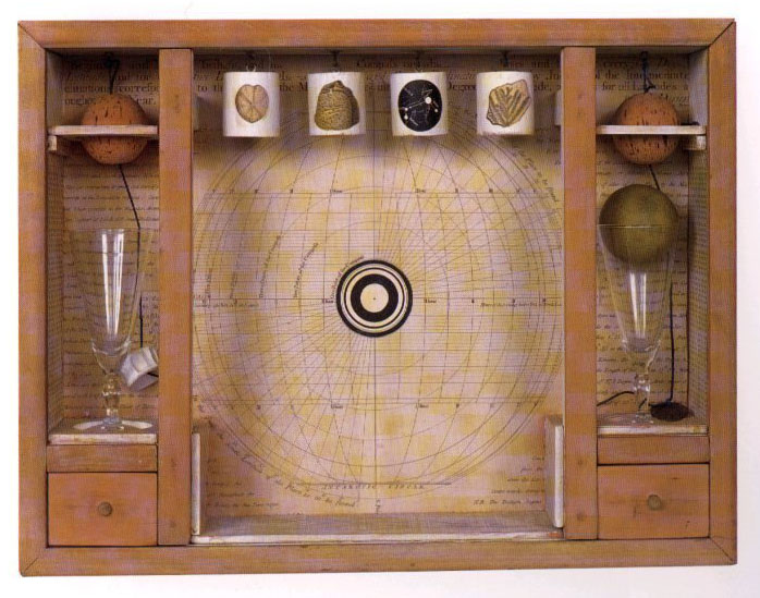
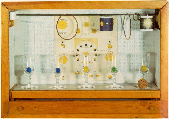
The colours used in this style are quite often organic and earthy colours, for example, browns and earthy tones. Although there are other colours used, these are probably used most because the artists use wood and organics in their works. The main images used in this style would also be things you find in the wild, like flowers and animals. There is also an abundance of wood but it isn't used as a main picture, more of a framing tool. The positive space in this style is very spread over a background, but if you change the position of your point of view changes, giving the works very good depth. The negative space is very diluted since the positive space is so spread out. This style of art is influenced by nature and the wild. There is an abundance of things like birds and wood in the art works so this is probably the main influence. The layout of the images is usually in boxes and on shelves making it a very dimensional style. The style can be very short (in terms of height) because it could just be one row of shelves. Or very tall using multiple rows. This style uses little type. When their is some sort of writing, it's not always meant to be distinguishable. The main techniques used in the style are placement of objects, crafting, sculpting and framing.

Pre-digital design
The colours in pre-digital design aren't as vivid and vibrant as computer enhanced stuff, a lot of browns are used, therefore make the image look kind of bleak if the colour range is used incorrectly.
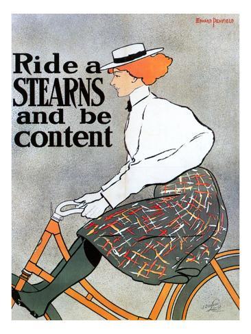
The main images used are people animals, and figures. There isn't a lot of detail mixed into the images and are quite plain and simplistic. The backgrounds are rather colourless or monotonial, meaning the negative space is quite flat, or dimensionless. The composition of this style is quite often a figure or animal on a monotone or simple background. The text/type is an obviously 1920s-30s era font that is easy to read. The colour of the text high contrast to the background but still looks good with the image. The techniques used by the artists in this style are paints and pencils, because there are no computers or programs.


Digital effects
The colours used with digital effects are colours that can be used with a computer to enhance or generate imagery. Colours that could be used are shade colours to make the main image more prominent by darkening the background and enhancing the main image by brightening it or vice versa, creating a heavy contrast between the two. Otherwise the colours can be rather bright and intimidating. The main imagery created with digital effects can look false/fake and wrong if the artist is inexperienced making digital effects a hard medium to use. Because digital effects are a common way to enhance an image, or make an image to use for a movie, the spacing is a lot like that of photographs, being real-world settings and spacing. Seeing as digital effects are on a computer, they are easy to upload to the internet and share around, meaning a lot of people see them and the influence spreads. Forums on the internet like deviant art are places where people share and discuss art, causing them to influence and motivate each other. The images are normally laid out with typical formatting i.e. a main image/foreground and background. The images are varied therefore the composition of the images can vary a lot too, although it is quite common in action movie posters to use an exciting scene from the movie created by digital means, the image will be a main component from the movie centred and enhanced to make the movie seem more exciting. Because it is done on a computer, text/type in a digital image is quite easy to add and change the fonts on. The techniques used in digital effects are specialist programs and tools on a computer such as the tools on photoshop and the programs itself, another program used could be aftereffects.


Illustration
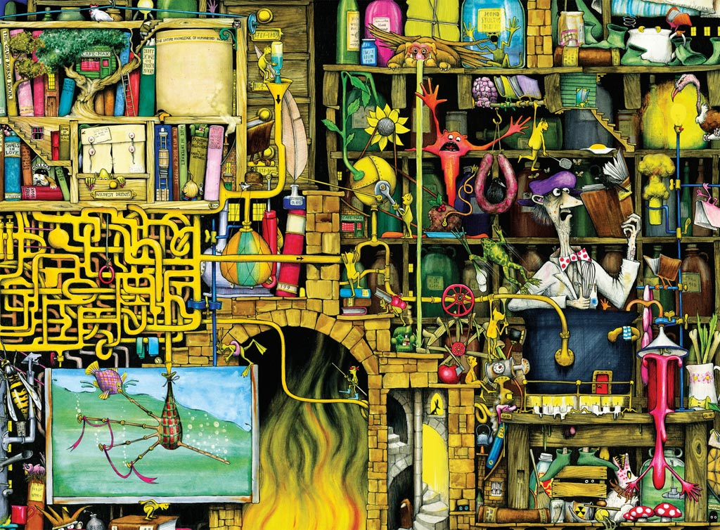
Illustration uses colours and greys for rendering to make the images seem more realistic. In non-realistic illustration, colours are very dense and vivid to make the image grab your attention more. The colours could work well by contrasting them with a dominant colour over the background colour to make the image more prominent. The spacing in illustration normally take a lot of space to make the picture stick out more and give you a better picture, rather than it being really small and making the background dominant. Illustration is normally used in duality with a story or similar texts, therefore mostly influenced by the story and the descriptions provided by the author. Illustration layouts are extremely varied because of how vague the term illustration is. They can be landscape images depicting scenes from books described by the author, characters, objects or even visual illusions. The composition is varied as well, because of how varied illustration can be. The style doesn't normally use type/text that much unless it was used in signage from the story/text, it can also be used for caption and such, but captions are not only limited to illustration.


Typography
The colours used in typography are normally used to make the letters contrast with the negative space/background to make the text more legible. The main images in this style are mostly made from text and type or are covered in it. The text can sometimes be hard to read but is used to make a point. The spacing with typography varies hugely because of the different fonts and spacing that can be used. There could be a very condensed word or sentence to make the focus on that, or you could spread it out so you cover the entire work so it’s the only thing you see. The style was properly influenced by artists such as David Carson and Neville Brody. It is used to express text/type for more than just the common writing words are normally used for text based images and artworks. The layouts in this style orientate around text/type. Typography dominates most of the image and actual images and pictures are sometimes a minor part. Typography is normally composed of text although it is not always readable. Typography can use some imagery. Considering typography is text/type, the text/type is used 100% in typography even though it is sometimes unreadable. The techniques used are writing and fonts, computers are also a big part of typography and are good with quickly figuring out different fonts.


Graffiti
Graffiti has a wide range of very vivid colour, but uses blacks for outlines to give form to the pictures and words. The main images of graffiti are usually the large bulging letters used or the cartoonish pictures. The spacing with graffiti is normally an extremely centred image on a wall, meaning that the image is very dominant and protruding. A lot of the influences on graffiti are self-expression and wanting to get a personal message across. Although it is considered vandalism, graffiti by artists (e.g. Banksy) is more trying to convey a message. Graffiti layout is done so that the main image is done on a plain background being much centred. The type/text in graffiti is usually very clear, as someone is trying to convey a message, or outright impossible in some of the “vandal graffiti.” Techniques used in graffiti spray-painting techniques and stencils.
 |
| Hard to read "vandal graffiti" |
 | ||
|
No comments:
Post a Comment